Showing posts with label magazine. Show all posts

Tuesday, February 19, 2013

Whimsical Wednesday!


You won't believe who are on the cover of Mega Magazine's February 2013 issue... Betty & Veronica! Turns out it is their first magazine cover ever! How whimsical is that?

I grew up reading Archie Comics. Even Isabella reads them. So I found it so surreal to see them gracing the cover of a Philippine magazine donning couture by top Filipino designers. On the cover, Betty is in a Veejay Floresca creation and Veronica's gown is by Cary Santiago.


Here, Veronica is clad in a daring ensemble by Inno Sotto and Betty's dress is from Furne One.


The newly-launched MAC Archie's Girls color cosmetics collection is what got these comic book icons on the cover of Mega.

It's so adorable how the Betty color collection captures Betty's sweet girl-next-door personality in pinks, peaches & sheer plums... 


A stark contrast to Betty's collection, Veronica's is seductive in vivacious reds, blackened plums & deep violets... The contrast nodding to the epic rivalry between Archie's girls.


Both collections celebrate the distinct personas of these two beloved characters. Not only through the color palettes, but also through the variant names. Betty's collection included names like Girl Next Door, Summer Sweetheart, Pep Pep Pep, Stay Sweet and Kiss & Don't Tell. Aren't they characteristically Betty?

On the other hand, Veronica's collection included names like Daddy's Little Girl, Boyfriend Stealer, Mall Madness, Past Curfew and Prom Princess.

How can you not swoon over full color cosmetics collections (No, they don't just come in lipsticks & gloss.) that remind you of your girlhood with your nose buried in a double digest - reading about the Riverdale gang's adventures in and out of Pop's Choclit Shoppe? Am not sure if I just missed it, but I didn't find MAC's Archie's Girls collection in this whimsical Mega issue (View more of the collection here). The issue did have a surreal interview with Betty & Veronica, as if they were real people.

Indeed, it was a whimsical issue! Love that even Mega Magazine EIC, Sari Yap, was drawn by American illustrator for Archie Comics, Dan Parent.


So put on some MAC lipgloss, grab your copy of this month's Mega issue & maybe even a Betty & Veronica Double Digest, and have a whimsical Wednesday!

Photos are my own and from here & nitrolicious.

Click here for previous posts from the Whimsical Wednesday! series.

Tuesday, July 31, 2012

Whimsical Wednesday!


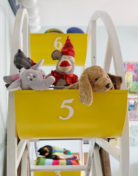
Isn't this such an adorable kid's room? I love the whimsical touch of a ferris wheel for storage. Imagine how fun it would be to spin the wheel around to get to the toys you want to play with! And wouldn't it make packing away so much more fun? 


I plan to re-decorate Noah's room in a few months so was looking through my inspiration folder and found these old photos from Sweet Paul Magazine. The issue talks about how the ferris wheel actually utilizes the dead space near the ceiling. So it's not only playful & inventive, it's also functional & a clever use of space. I think the mix of wood and the playful elements make the room one that can grow with the child. Oh, and notice the carpet? They're actually smaller rugs stitched together so that when an inevitable permanent spill happens (as is natural in every kid's room) mom can replace just the damaged rug rather than a whole carpet. Plus, the patchwork of rugs looks pretty cool, right?

Loving the whimsy in this kid's room! Have a whimsical Wednesday!

Photos from sweetpaul.

Click here for previous posts from the Whimsical Wednesday series. 

Saturday, May 5, 2012

Color Obsession: lavender


Lavender has been catching my eye lately. It started when I saw this lavender stingray Anya Hindmarch Minaudiere here.


Then I saw this VW camper. Okay, maybe this Kombi is more periwinkle or thistle than lavender, but I guess I'm loving all sorts of soft purple!


Then, I bought a copy of InStyle's May 2012 issue...


And finally, this lavender Hermes...


... which introduced me to the lavender & brown combination. And got me thinking about other colors that can go with lavender. Check out this palette I made on Polyvore.


My picks, by color, are:
  • Lavender & Yellow - Kenneth Cole Yellow Circle Pendant and Kate Spade 'triple threat' faceted bangle
  • Lavender & Orange - Debenhams Statement Orange Stone Ring and Tory Burch logo pendant necklace
  • Lavender & Navy - Proenza Schouler Mini PS1 Pouch
  • Lavender & Brown - Mulberry braided leather belt, Fossil Brown Tone Dyed River Shell Stretch bracelet, Marc by Marc Jacobs Brown Wooden Bolt bangle and Cartier Ballon Bleu Brown Dial men's watch (I looove that this Ballon Bleu has a brown face!)
  • Lavender & Gray - Palazzo Bruciato Giorgia leather lace-up shoes (but I would have loved to pair this ensemble with silver Sergio Rossi brogues!)
  • Lavender & Nude - Michael Kors stretch-cotton broadcloth shorts
  • Lavender & Seafoam Green - Debenhams Mint Green Chunky Enamel bangle and Zara Pointed Ballerinas with Bow

Ooohh, I am still loving Spring's pastels!

Photos from baghag, pinkwallpaper, polyvore, here and here.

Click here for the down-in-the-dots version of this post. Click here for previous posts from the Color Obsession series.

Friday, January 27, 2012

my kind of gal


I am captivated by this girl. She has embraced the philosophy I’ve been writing about in the past 200 or so posts. She is positive and life-affirming. She may not be so domesticated because she believes that “a perfectly kept house is the sign of a misspent life” (Mary Randolph Carter), but she does try. She knows that “It is better to be absolutely ridiculous, than absolutely boring” (Marilyn Monroe). She indulges, without shame, in things – big or small – that make her happy. She knows that style is personal and enduring, not dictated by what the fashion industry offers you every season. She loves to curl up with a good book on a lazy, rainy day. She dreams big and is bold enough to follow her dreams and live the life she imagined. She is an effortlessly elegant & unpretentiously cultured woman, yet still a girl with a hint of childish mischief, charming spunk and whimsical zeal.
I imagine this perfect gal to have these perfectly fine imperfections.

Wouldn't you want her as a friend too?


Especially if she had this mantra, right?

Photos from sparklesandpretending and annnniegirl. Matchbook is an online lifestyle magazine that inspires women to design a life they adore. Enjoy a field guide to a charmed life here.

Friday, January 6, 2012

Color Obsession: gold


I was always a silver rather than gold kind of gal. I had always thought gold was tacky. But I realize that lately, I've been drawn to gold. I still prefer rose gold, bronze & antique gold over yellow gold, but I've certainly been wearing gold jewelry more these days (especially my 90-year-old Lola's vintage jewelry which are all sorts of gold).


There is definitely an air of opulence to gold. Particularly on the dinnertable. Don't these gold chargers make this table quite elegant? Especially with the crisp, black napkins!


I'm totally charmed by this gold silverware (Ironic, right?).


I love the contemporary style of this silverware. Imagine if these gold utensils had those ornate curly-cue carvings? They wouldn't be fit for home-use - unless the Queen of England came to visit! This sleek deco design makes them appropriate for dinner parties at home.


On the other hand, this ornate front facade wouldn't be the same without the elaborate gold curly-cues. Now isn't this the most regal-looking city hall?


I also love the gold and navy combination. Isn't this gold tray set off perfectly by the striped navy bedlinens? Is there anything more chic?


Even when worn, navy tones down gold and gives this sparkly skirt a stylish but effortless look. 


Yes, gold... paired with black or navy... is worth obsessing about. After all, everyday should be filled with effortless elegance.


Click here for previous posts from the Color Obsession series. 

Thursday, October 27, 2011

Color Obsession: pink


Before National Breast Cancer Awareness Month ends, let me share with you some pretty images of pinkness.


Detected early, breast cancer is 98% curable. Yes, 98% curable. So have yourself checked today and every October after!

And since am on the subject, sharing this link from Harper's Bazaar on how to wear pink. My faves are Victoria Beckham's pink shift and the Mulberry pink satchel!

Photos from i'mjustsaying, a regular source of delightful pinkness, and sparklesandpretending.

Click here for previous posts from the Color Obsession series.

Thursday, October 6, 2011

magazine art remembered


Remember this vintage Vogue cover from my previous Magazine Art post here? I did see the simply elegant magazine covers as art on the wall then, but now I think displaying them amidst books on style, perfume and fashion accessories like this is a much more befitting home for this exquisite fashion magazine cover. They belong with that portion in your home with the most style, glamour and sparkle! 

Photo from everythingfab.

Thursday, June 2, 2011

some polka dots i spotted...

With all the fuss around Blake Lively this week, I thought she deserves some happy buzz. Coincidentally, she graces Glamour's July 2011 issue in a polka-dotted top and shorts!

I love the sultry heavily-lined eyes. And I know she isn't in dots in those other two photos, but am crushing on those shoes and what I can glimpse of the dress in that brightly-lit photo. And how can I not sneak in a photo of this Chanel Mademoiselle? After all, it is Blake Lively.

Photo credits: fashion paparazzis and Chanel

Sunday, May 29, 2011

magazine art

Who would have thought magazine covers could display such artistry? These subscription covers of Harper’s Bazaar are absolutely gorgeous. They are stunningly picturesque. The cinematic photography has so much flair and drama, making the covers incredibly enchanting. Totally different from their newsstand versions that scream “FASHION! New Looks! BAGS! Shoes!”

Isn’t the difference between the newsstand cover and their subscription version remarkable?

Interestingly, the subscription covers are reminiscent of vintage covers. There is a surreal and elegant quality in these old and new covers. 

I love how the May 2011 subscription cover with Gwyneth Paltrow (or Renee Zellweger in December 2007) captures the glamour and opulence of the 1950's covers.

But really, the cornerstone of vintage covers is really beautiful simplicity. They took it somewhat to the extreme back then.

Nevertheless, subscription covers have imbibed this simple, exquisite elegance, so you can hardly tell which is old and which is new. Can you?

I can already imagine the utterly stunning cover with Demi Moore and a giraffe on my wall, just like this one from Domino Magazine which showcases vintage covers. See how I altered the room (from french by design blog) with my favorite subscription covers.

Truly, these magazine covers are works of art!

Thanks goes to www.101gramsofeyecandy.blogspot.com where I first discovered that subscription covers are different from their newsstand versions, to http://stephanie.posterous.com where I found side-by-side comparisons of the 2 cover versions, to www.escapadeblog.com which inspired this post and provided many vintage covers and even the room photos, and to all my other sources of Vogue and Bazaar covers - old or new.

Wednesday, May 25, 2011

some polka dots i spotted...


What is more fun than a polka dot shake?

strawberry shake with marshmallows
serves 2

1 1/2 cups milk
2 large scoops vanilla ice cream
1 cup pitted strawberries
6 marshmallows cut in half


Place milk, ice cream and strawberries in a blender and blend until smooth.
Press the cut part of the marshmallows onto the inside of the glass.
Pour and serve.

Courtesy of the Spring 2011 issue of Sweet Paul magazine which I am absolutely loving!