Showing posts with label subtlety. Show all posts

Sunday, January 13, 2013

my week of cuteness


My whole week last week was a mishmash of the cutest, most adorable things that made my heart go pitter-patter!

Day 1:

My niece was in the hospital for dehydration. :( But when we visited her, she was quite smiley, playing games on her iPad. I myself couldn't help but smile at the wallpaper in her room! Isn't this wallpaper the cutest?


Glad you're all well now Denise! :)

Day 2:

I was delighted to discover that Saizen Galleria now has a whole shelf of Sanrio stuff! Yes, Sanrio knick-knacks for PhP88!


I was sooooo tempted to buy the Little Twin Stars bags (that I have absolutely no use for). Awww... Kiki and Lala... Memories of my childhood...

Day 3:

Such cute colors all in one bangle! Reminds me of these yummy colors.


PhP280 at the Greenhills tiangge.

Day 4:

Ate with my friends L & T at this cute little restaurant, Stacy's, in Capitol Greenstreet in Capitol Hills.

The interiors were sooooo adorable!


Notice the pink rotary phone & fridge, the chalkboard panels & matroyshka print? Oh, happiness!

They actually had me at hello because that pink polka-dotted mug with popcorn, strawberry pretzels & marshmallows is what they greet patrons with. I was late for our lunch date and L & T resisted eating the sweet table treats just so I could see the pretty mug when I arrived. Such sweet friends, right? :)


I was also delighted to see my heart-shaped rice. :) Too bad I forgot to take photos of the striped paper straws that the drinks came with and the butter ball candies that came with the receipt. They really paid attention to the littlest details... like these ones...


The servers actually wore Cath Kidston aprons like those. And that picket-fence area is actually a play area for kids - with a mini garden set and toy bread in a gingham-lined basket. Is it obvious I was smitten?

Day 5:

I was still gushing over Stacy's so I decided to write a post about it. But I couldn't remember the new name of the Capitol Hills complex where the resto belonged. So I googled it and stumbled upon Our Awesome Planet's review of Stacy's. He called the interiors "Heima-inspired" so naturally, I clicked on the link and found the website of the cutest store! Heima sells the most adorable things too (washi tapes included)!


I want the chalkboards in all colors (they also have it in a mustard-looking orange and a navy-looking blue gray)! And I loooove the subtle tiffany blue button-tufting & seat-piping peeking out from the gray T-shaped chair!

Day 6:

I trooped to Rustan's Shangri-la Tower for Dwell Studio's End of Season Sale.


I was never a big fan of pink, but I guess all the cute pinks this week got me so enamored by the pink version of my chocolate Madison Dots bag.

Day 7:

The Bitbit The Rabbit Plush Toys I ordered from Spinkie arrived! I bought them as gifts for 2 adorable babies.


But I secretly wanted to keep the plush toys for myself. Even through their plastic container, they looked so soft & cuddly.

Oh, it was such a delightful week! All these adorable things, as Heima perfectly put it, "made my senses smile & my heart flutter". Happiness!

Photos are my own and from Heima & Spinkie - edited on my iPhone with the free Instapic Frame/Collage app.

Oh, in case you didn't notice, the colored words throughout this post link to more happy, adorable things! Happy clicking! :)

Tuesday, December 25, 2012

a wish come true


Remember how I was wishing for a Tiffany & Co gift here and here? Well, I got my wish this Christmas!

The hubby got me the perfect (for me) pair of sunglasses! You see, I have the traditional Filipino's pango (flat) nose. I hardly have a bridge so I can never wear shades without nose pads. Because I've so wanted nose-pad-less shades, I used to buy one every now and then but the rim would rest on my cheeks and after wearing them a while, the shades' bridge would eventually sink to my low nose bridge and I would look like a grandmother peering out on top of my glasses. And if I bowed my head, the sunglasses would surely fall to my lap because it wasn't clutching my nosebridge at all. Plus, I might also have an odd-shaped head, 'coz I can never raise my shades up to my head like a hairband. It would always pop out!

Because of a number of disappointing experiences with nose-pad-less eyewear, I'd given up even trying them on already.

But these Tiffany shades rest perfectly on the bridge of my nose. And even if I bow down, they stay stuck to my nose. And I can wear them like a hairband when the sun goes away! So perfect for me! :)


As if perfect wasn't perfect enough, it has all these perfect little details... The Tiffany key... 


... and the Tiffany blue color peeking out through the sides and the frame's insides.

And the subtle branding - a tiny T&Co. - on the inside of one of the temple tips...


But to tell you the truth, this gift had me at hello. I saw the iconic Tiffany blue box and I was already smitten! 


I already knew whatever was in it was a wish come true!

Photos are my own and from here & here.

Get your own pair of Tiffany eyewear at Adora in Greenbelt 5.

Sunday, July 15, 2012

of peekaboos & panels


This is what I loved about Project Runway Philippines Season 3 winner, Milka Redoble's finale collection: the peekaboos & panels.

The curved panels & layers are subtly reminiscent of her collection's muse: the Musa, genus term for the banana. They certainly added interesting detail to her monochromatic looks & structured silhouettes. I found her subtlety & restraint quite impressive. Her chosen inspiration could have led her down the wrong path -- going over-the-top with the silhouettes or horribly literal with the color palette (Can you imagine if her collection was in yellows, greens & plums? Gah!). 


The curved panels also put an interesting twist to color-blocking. Am not loving the silhouette of the top, but the skirt is quite fabulous. The uneven peplum (I call it pumi-peplum, hehe) is also of interest.


But what I loved most about this winning collection is the peekaboo lining. None of the photos caught it, but that 3rd dress in the topmost photo actually had plum peeking out of the pockets. The official PRP photo here of the 1st dress also failed to catch the black lining peeking at the slit. You see a little in the topmost photo and more of it in the photo from MEGAstyle. My absolute favorite peekaboo lining (though am not a big fan of the bodice) is this...


I looove those curvy stripes running underneath! Many have called Milka an intelligent designer and I have to agree. I found it amazing that her quietly understated details made such a loud but elegant statement.

Photos from Megastyle, here and here.

Click here for the down-in-the-dots version of this post - the one about the PRP runway show I did watch. Click here for previous posts on subtlety.

Saturday, May 26, 2012

style inspiration


I've been so obsessed with Spring's pastel colors and prints this whole summer, that I've decided to take a break from a color-filled wardrobe. I've decided to slip into some classics with a twist. They look quite plain at first glance. But I like that there is a detail or two that makes it subtly stylish.

Because it still doesn't come naturally to me to mix black with brown (though I've come a long way from struggling to resist it here), I find the nude shoes with black trousers above chic-ly unexpected.

I also gravitated towards this look. It's just a classic white button-down with khakis. But I think the lace camisole gives the man's shirt a soft feminine vibe. And the knotted belt (vs. the traditional inside-the-belt-clasp) gives it a nonchalant hard element.


And finally, this striped shirt with the orange cuff.


Don't these little details give classics a chic subtle twist?

Saturday, September 17, 2011

my pretend shopping

It's been a busy, busy week. Even my weekend is filled with errands and a work event. So I snuck in some pretend-shopping online at Zara.com. Here are the things in my pretend shopping bag...

I am smitten with the subtle color-blocking in this two-tone skirt from the August 2011 Lookbook.


I just love the shape & structure of this dress with zipper details...


I am also eyeing this Patchwork Court Shoe and these Celine-isque Mini Shopper Bags (though I need to check out if these minis can hold all my things)...


I love that pretend-shopping can tide me over until I get the chance to actually step foot in a Zara store. :)

Photos from Zara.

Click here for previous My Pretend Closet posts.


Wednesday, August 17, 2011

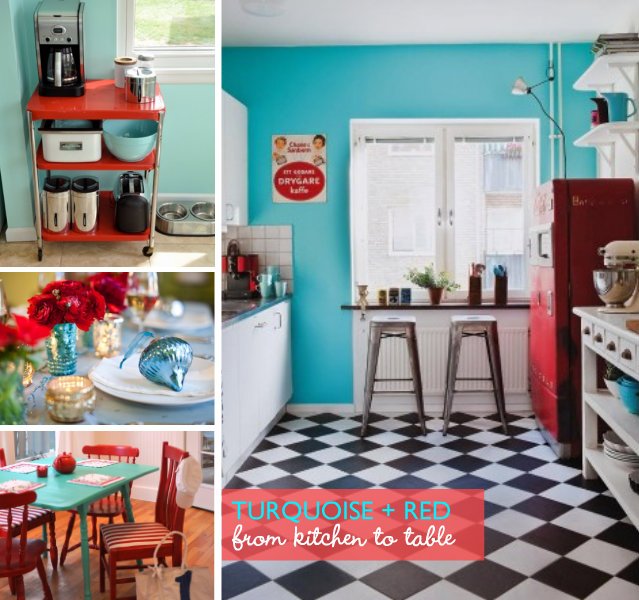
Color Obsession: Turquoise and Red

I would never have thought of this color combination until I saw this image from Garance Dore.


A bit of surfing... and the color combo grew on me!


What about you? Did turquoise + red grow on you too?

Maybe we should start with small doses. Like a turquoise + red accent piece...

Can you imagine wearing turquoise + red?

Or would you rather start with something subtle like this turquoise trench with peekaboo red lining from the Burberry Prorsum Resort 2012 Collection?


Dorothy seemed to think it looked good. And she's been wearing this combination for ages! :)


Photos from Garance Dore, chewingthecud, stylecoaching, here, here, here, here and here.

Click here for previous posts from the Color Obsession series. 

Saturday, August 6, 2011

Today, I am loving...

Today, I am loving this typography-initial trend.
  • I know there are quite a bit of ampersands in the photo above, but I love them (see related post here).
  • Katie Holmes' Jennifer Meyer diamond-encrusted pendants reappear because I am still in love with the idea of wearing your children's initials around your neck (see related post here).
Initials in various typestyles are everywhere these days. On walls, in rooms, stenciled on cabinets...

Even Mikka of a mischmashed life has an ongoing alphabet wall project inspired by this...

I am so drawn to the varying typefaces, colors and sizes that I might start my own alphabet wall in my son's room: aBCdeFgHijkLMnOpQRstUvWxYz!

I am not really a lover of serifs as you might have figured from my Trebuchet font choice here. But I can't help smile when I see this serif tote. I love how the bag strap merges with the serif and how they kept to an asymmetrical look with one serif rather than two flowing from both straps!

Today, I am loving... serif or sans, the typeface initial trend!

Photos from lushlee, a mischmashed life, inspirationoohaah, chewingthecud and blondiensc. Photo credits of reappearing photos can be found in their original home-posts.

Thursday, August 4, 2011

the man behind the subtle stripes

Do you see those stripes peeking out of this man's cuff?

I still think the God-made stripes top these man-made stripes (see post about this here). But am still quite enamored by the subtle stripes I first talked about here (see the dots version here).

And guess what? I've discovered who's behind these subtle stripes!

Turns out it's American fashion designer Thom Browne.

Don't you just love how a brand's tag lends a subtle stylish detail to these fashion pieces?

Photos from streetfsn.


Tuesday, July 26, 2011

Harry Potter and the Detailed Highlights

While Harry Potter and the Deathly Hallows Part 2 is showing in every cinema, I thought it was the perfect time to remember the amazing attention to detail given to The Wizarding World of Harry Potter in Universal's Islands of Adventure in Orlando.

I won't talk about how you feel transported to a magical world upon entering Hogsmeade. I won't talk about the obvious sights and attractions - the tour of the Hogwarts Castle, Hagrid's hut, the Diagon Alley and Hogsmeade shops - which you can surely find via Google or on YouTube.


Because apart from the obvious sights, I particularly loved two subtle details. First, the Moaning Myrtle in the bathroom. It's really just an audio recording of Myrtle's moans, but I love that they thought to put in that little detail. So make sure to pay a visit to the washroom even if you don't really need to go. :) Second, this wizard's note-taking! He's the wizard "guarding" the door to Ollivander's Wand Shop. He basically decides how many people from the long line can go through the door for the interactive wand-selection experience. He has this moleskin-looking notebook where he logs the number of people entering the store per show. And look! Look at the heading on his notebook!

He does not flaunt his notebook at all (the only reason we noticed was because we were at the very front of the line and we were incredibly nosy observant) and yet, he takes the trouble to call us "Muggles" in it. 

Apart from everything there was to love about The Wizarding World of Harry Potter, I especially loved these subtle details.

Hogwarts Express photo from here. The rest of the photos are our own.


Thursday, July 14, 2011

Today, I am loving...

Still on subtlety. Today, I am loving... these subtle stripes. They lend a relaxed and quirky feel to an otherwise elegant, but drab outfit.

Did you notice that the seam under those buttons on that man's cuff is also striped? And that his tie-clip has a tiny striped detail too? Or that this man's shoes has striped tags sticking out at the back? I almost didn't notice these striped details because I was so charmed by the striped band on the woman's pants.

And how can I write a post about subtle stripes without including this subtle appearance of the iconic trainspotting stripes of Bally?

Oooohh, I am so loving these subtle stripes!

Photos from streetfsn and Bally.